Abstraction
What is abstraction?
Abstraction in photography usually refers to an abstract image, if something is abstract normally the artist has gone beyond the information he of she sees un the camera lens, and gives it a completely different meaning by taking it out of the context. A abstraction, is an image usually that doesn't represent a common object, but is more about lines,colours,shades and other elements. abstraction in photography looks beyond what you see to create something on how you feel.
Abstraction in photography usually refers to an abstract image, if something is abstract normally the artist has gone beyond the information he of she sees un the camera lens, and gives it a completely different meaning by taking it out of the context. A abstraction, is an image usually that doesn't represent a common object, but is more about lines,colours,shades and other elements. abstraction in photography looks beyond what you see to create something on how you feel.
|
|
ABSTRACTION This video clip will give you a bit more insight about abstraction in photography and demonstrate parts of abstraction and how you produce and make them your self. What's interesting? The video shows a good understanding and gives positive ways about how to get the best picture you can and it also shows how you can build up to the photograph and explains how to produce a abstraction with out using such a good camera/lens. |
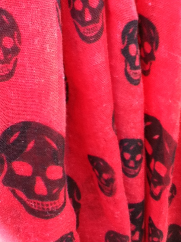
The Formal ElementsFocus: focus Is what appears the most clearest In photographs and the sharpest.
Light: Light Is the brightest part of the photograph and normally causes a shadow creating contrast. Line: Objects being used to create lines in the photograph. Repetition: Is when an image or element is repeated. Shape: Are shapes in the image curvy or straight edged etc..... Texture: Texture Is how something feels or you might see the texture within the image. Value/Tone: Does the picture contain a range of lighting, where Is the darkness? where is the light? |
|
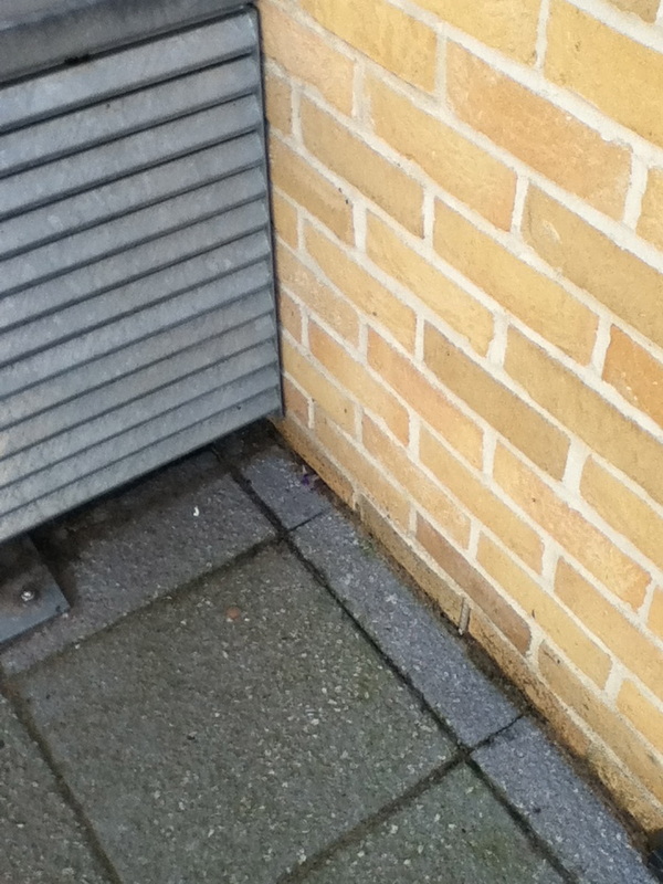
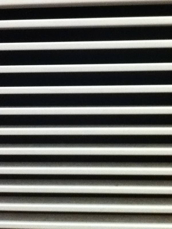
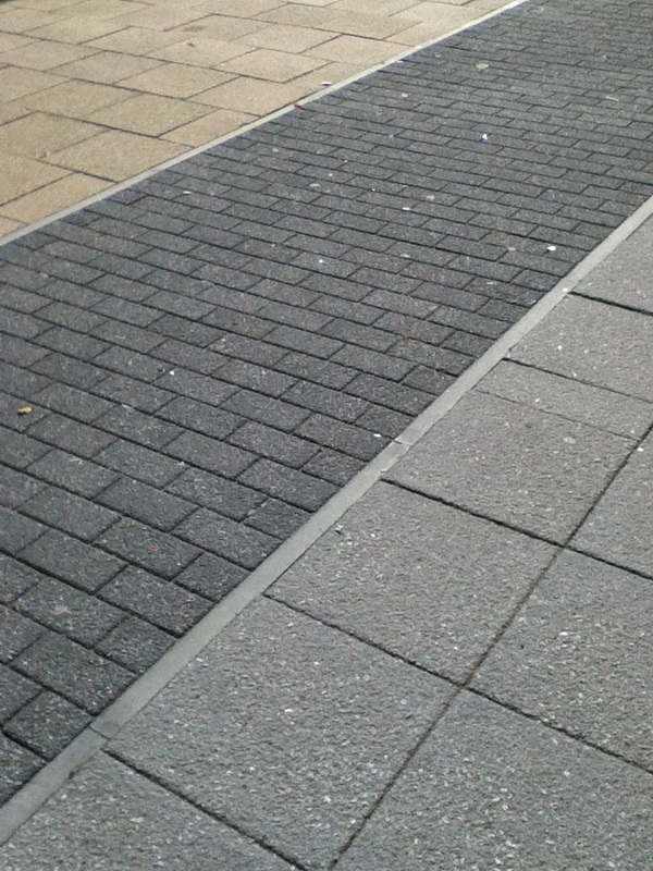
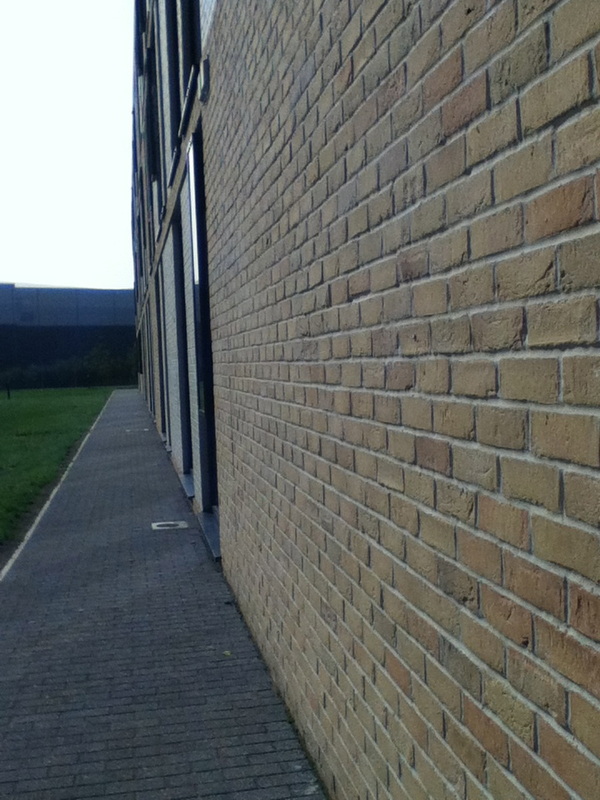
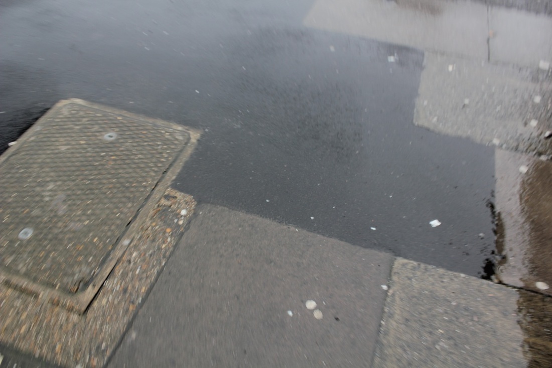
First photo shoot: Lines
I took photos of lines around school. The camera was in focus, but is not the best of the best. Some have shadows, some are too light, but I will continue to develop these images and edit them to be more imaginative and to make the photos work more effectively.


Set #2:
Chemigrams |
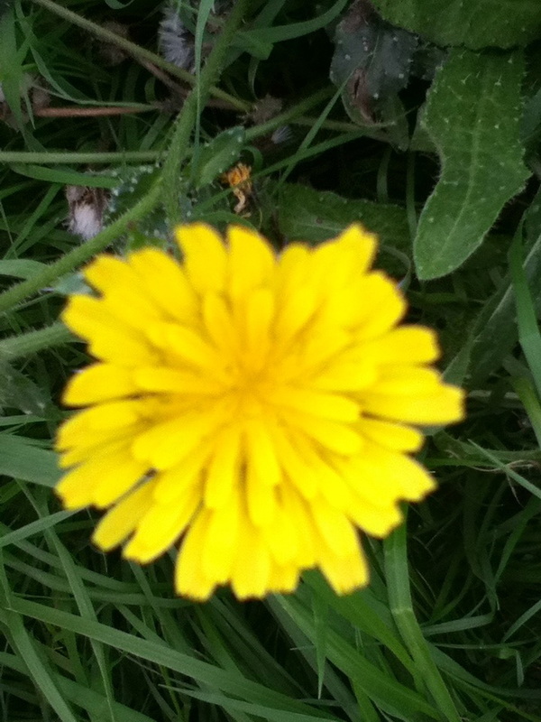
WWW: The focus of the "yellow" flower went really well and the f focus for the back ground worked out really well as it mad the flower stand out a lot more, and kind of gave of a question "why is the photo like this?" "why have i got a out focused background but a clear object in front of the un focused background?" EBI: I believe that if i used the camera in different ways i could have produced a different style of the photograph that i actually produced |
"The essential tool of the photographic process is not the camera but the light-sensitive layer." László Moholy-Nagy
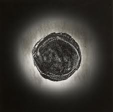
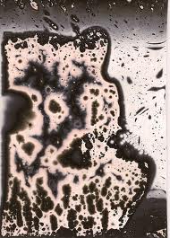
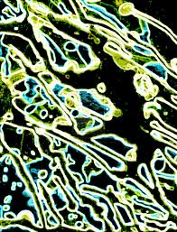
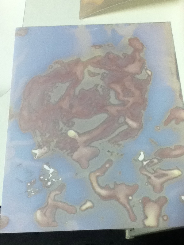
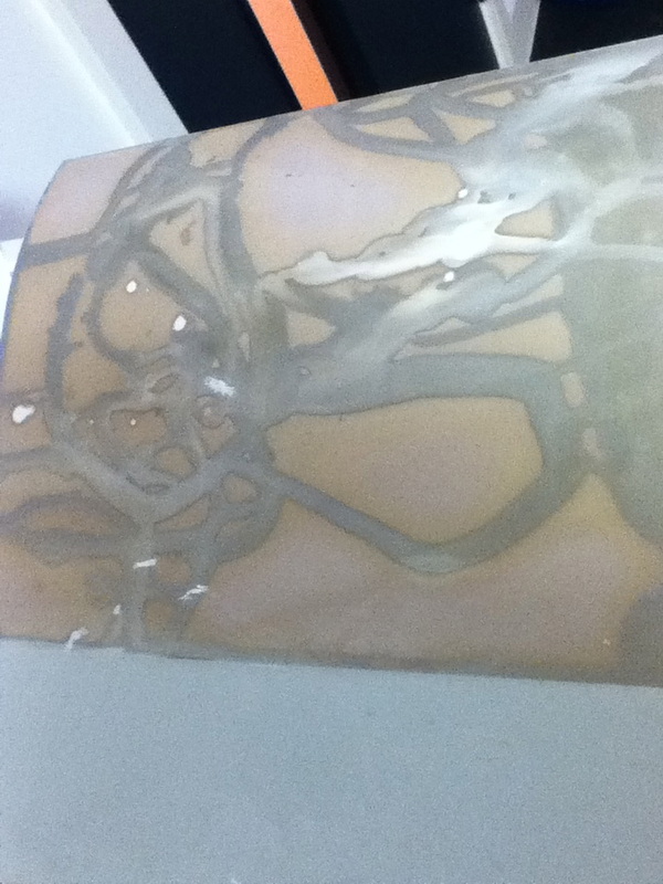
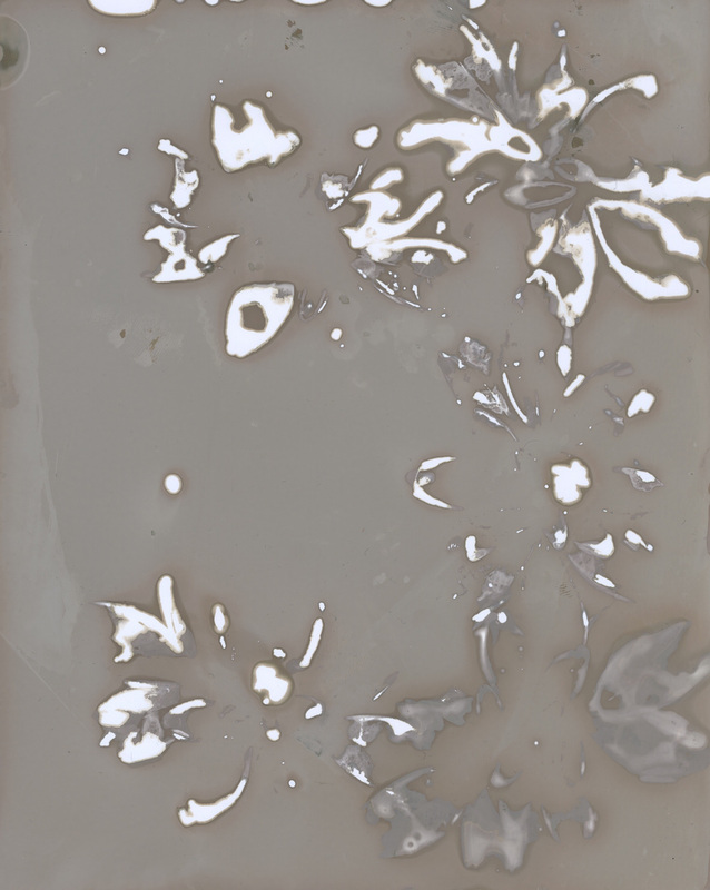
The chemigram is made without a camera, yet it is created in full light instead of in the darkness of the darkroom. It produces a picture/photo with just chemicals and other materials. Down below are some examples, which are simply made from the exposure to light.
The chemigram is made without a camera, yet it is created in full light instead of in the darkness of the darkroom. It produces a picture/photo with just chemicals and other materials. Down below are some examples, which are simply made from the exposure to light.
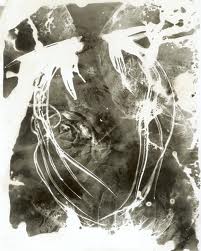
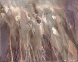
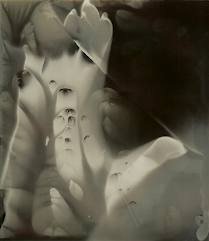
The stages of how to produce your own chemigram
|
Developer |
Stop |
Fix |
MY OWN ATTEMPTS:
|
|
How did I do this?
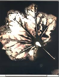
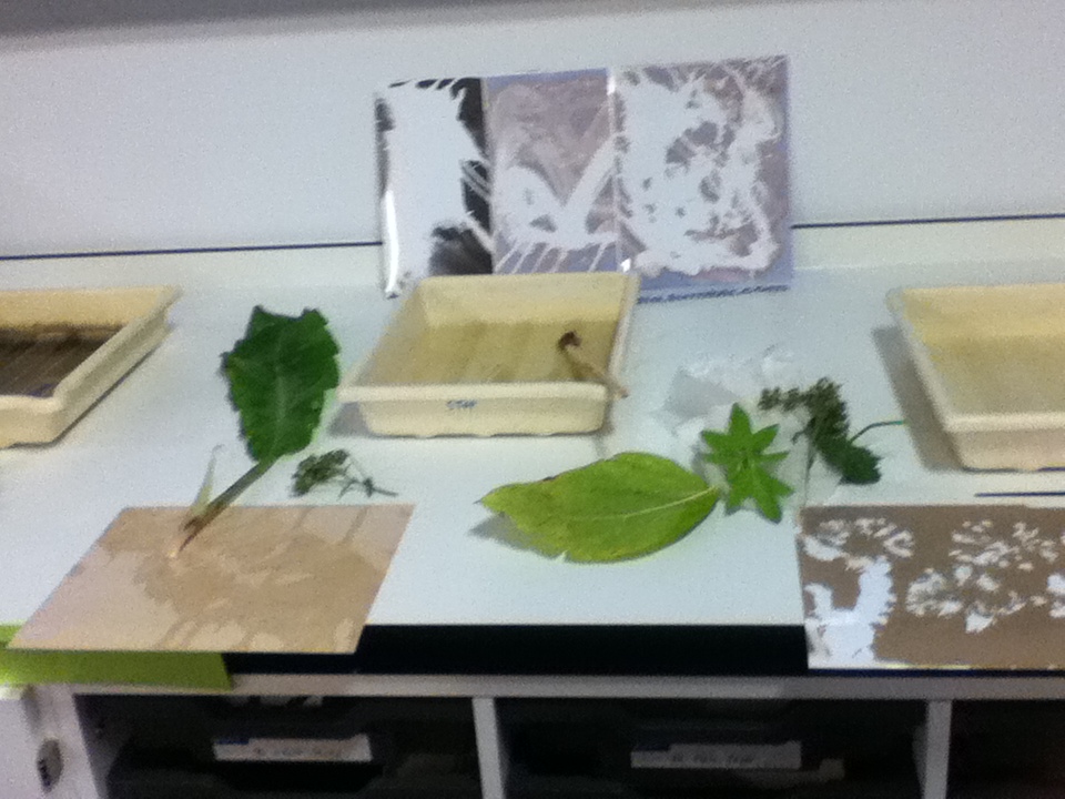
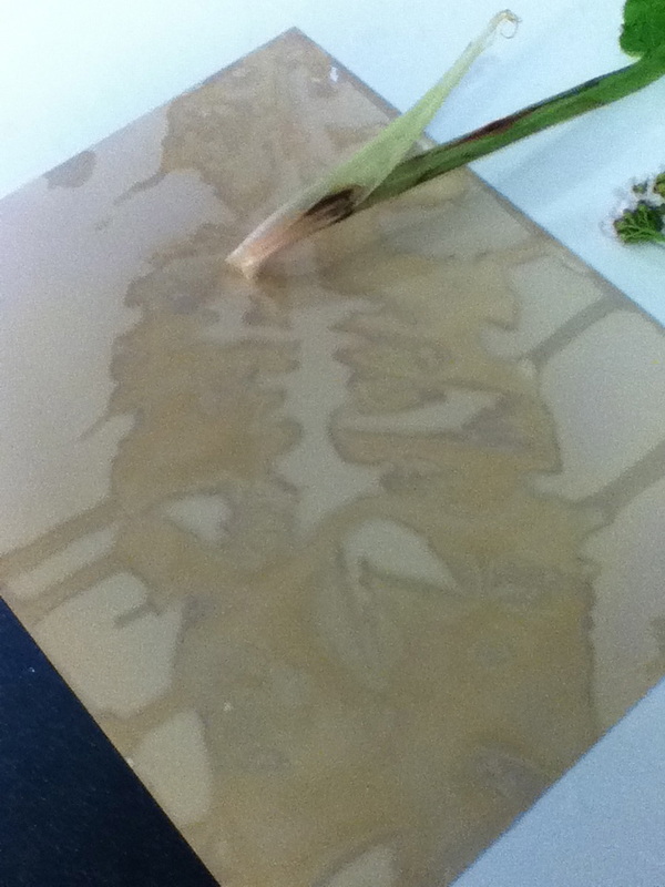
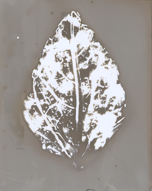
I took a trip to nature. I selected different objects from the school environment like fallen leaves of trees and bits of flowers and twigs to create a weird image with the outline of leafs, and the veins of the leaf also the bark of the trees. I then collected a couple of sheets of photographic paper then I covered each object in a different chemical and pasted it on to the paper, and gently pressed down so it took the outline of the objects and the detail, I then exposed my photographic paper to the light, once the photo was created i could either choose if I wanted to develop it or not.
I took a trip to nature. I selected different objects from the school environment like fallen leaves of trees and bits of flowers and twigs to create a weird image with the outline of leafs, and the veins of the leaf also the bark of the trees. I then collected a couple of sheets of photographic paper then I covered each object in a different chemical and pasted it on to the paper, and gently pressed down so it took the outline of the objects and the detail, I then exposed my photographic paper to the light, once the photo was created i could either choose if I wanted to develop it or not.
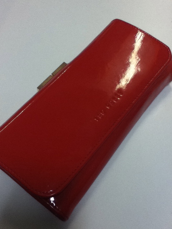
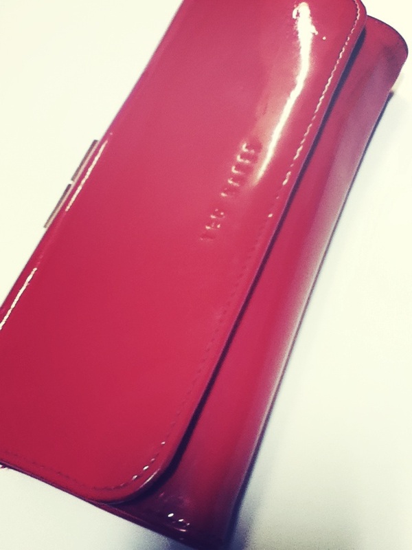
Experimenting with colour
|
|
I am going to take a series of images that relate to colour and then I am going to produce a colour weel of all of the picture but in to a colour weel to see the type of colour used. All photos need to be bright and the same size so its a perfect circle.
What's My Inspiration? William Eggleston's work inspired me to the subject/theme of colour. Eggleston, is an American photographer. He is widely credited with increasing recognition for colour photography as a legitimate artistic medium to display in art galleries. His photos that inspire me the most re the ones that are focused on just one colour and they feel the whole ratio of the image with the detailed image and the colour with the contrasting of the lighting. |
I have taken a series of mages focusing on colour inspired by William Eggleston.

WWW
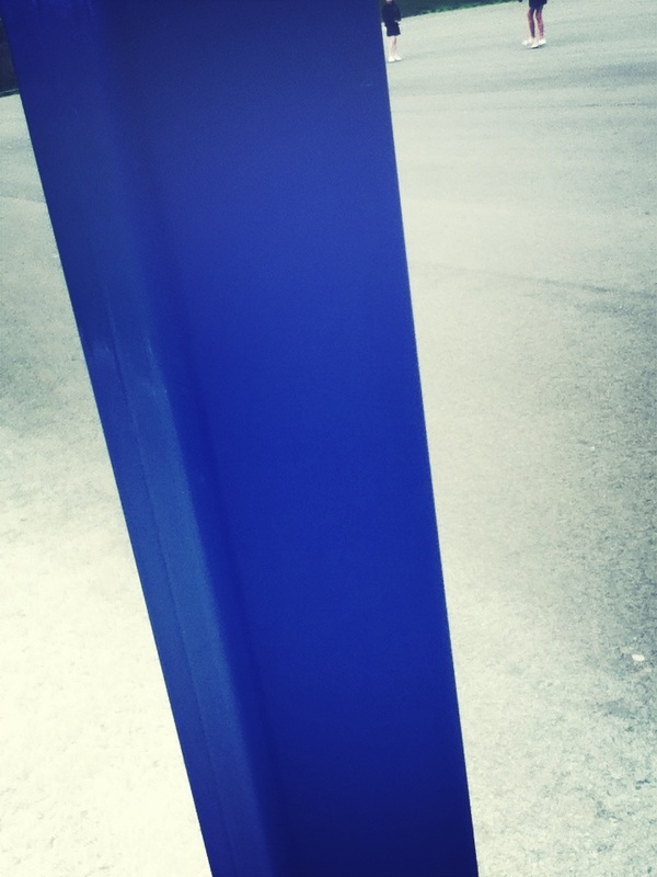
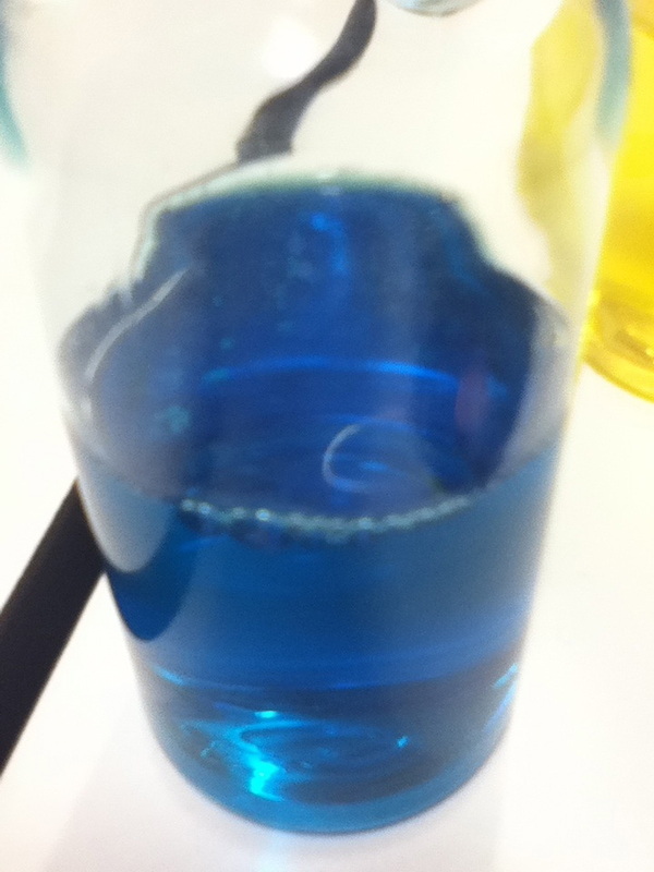
The colour of blue has really worked, as its big, bold and relates to the formal element of colour. The big chunk of blue really works because it the main focus of the photograph. www-The focus on the colour blue. EBI I had more blue covering the photo. |
WWW
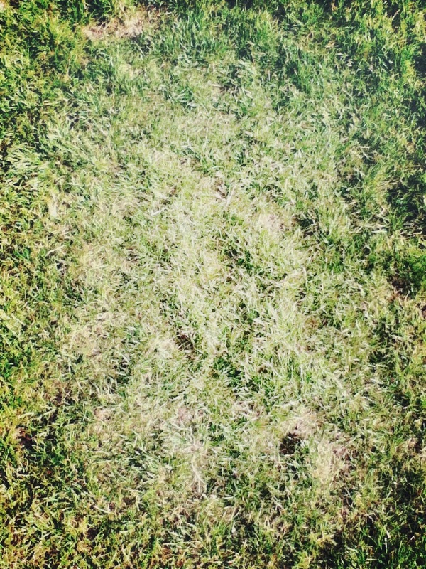
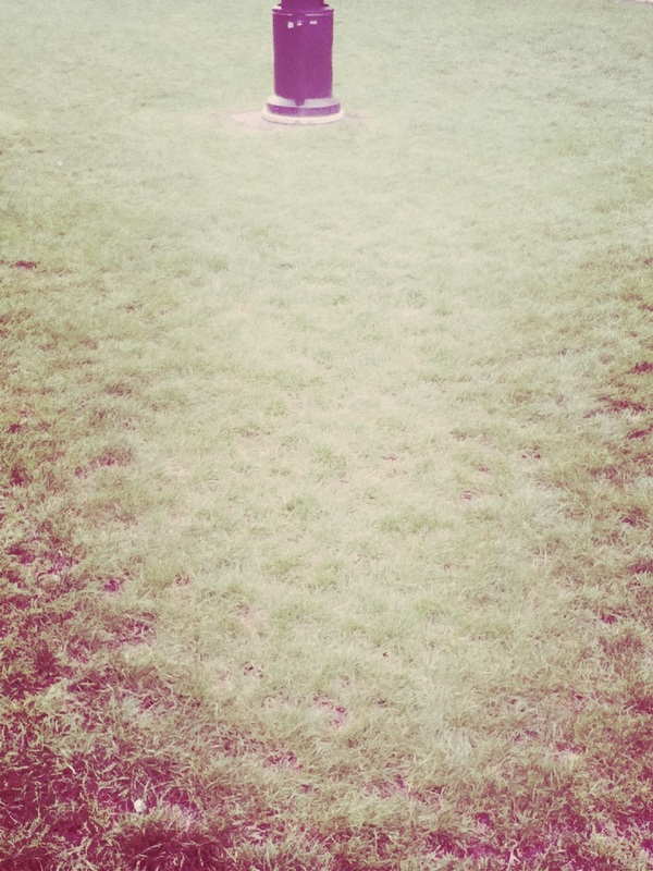
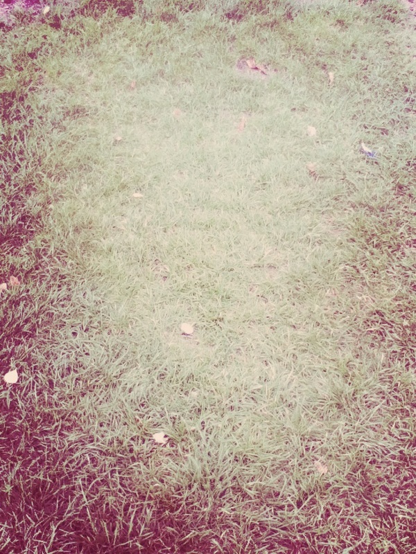
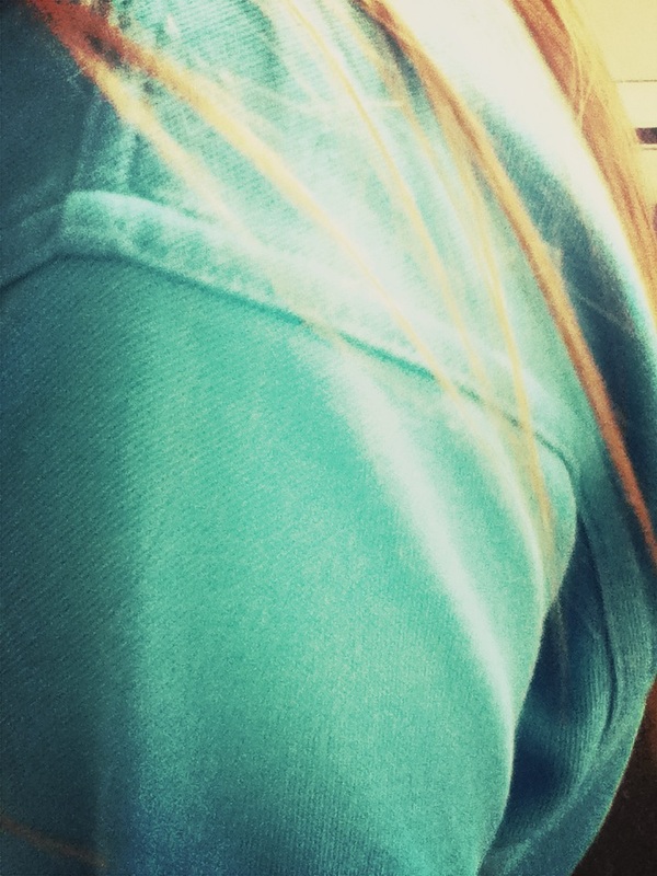
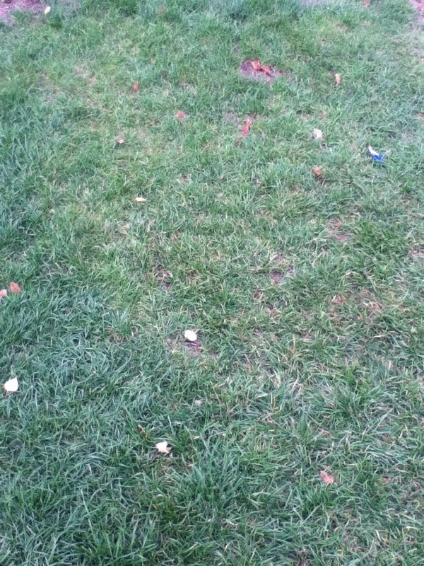
This photo didn't work out as work as I expected as the lighting was to bright and the camera was not in focus its blurry and you can hardly see the colour green. The thing that went will with this image is that the whole photo is full with grass. EBI I focussed the camera more to sense the colour green. |
I am interested in creating a series of images revolving around leaf patters on to chemigrams and creating a weird picture, with different pictures I have made by the process of chemigrams another idea is to focus on one of the formal elements and create a colour wheel with each colour of a rainbow. I am researching the work of Pierre Cordier who inspires me with the work of his chemigrams. Over half term I plan to take a series of photographs and upload them to Weebly and evaluate them in full detail. I also plan to update my website with my latest research ideas.
Here are some photos that I created over the half term. I took images of colour because it was the best way to find the correct colours for a colour wheel which is one of my initial ideas. Down below this text I have selected two photos that I have evaluated. I felt as if most images taken focused on the two colours blue and red. Which kind of made me feel as if there wouldn't be any point evaluating the same colour.
|
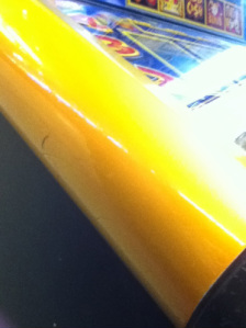
WWW:
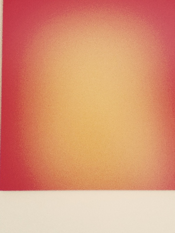
The focus of yellow and how I got the colour yellow to nearly fill the whole of the photo. EBI: If I had taken the image in focus because there is a shadow on in the photo which causes a little bit of lighting that is not suppose to be there. I could prevent this by using a different photographic device instead of an iPod |
|
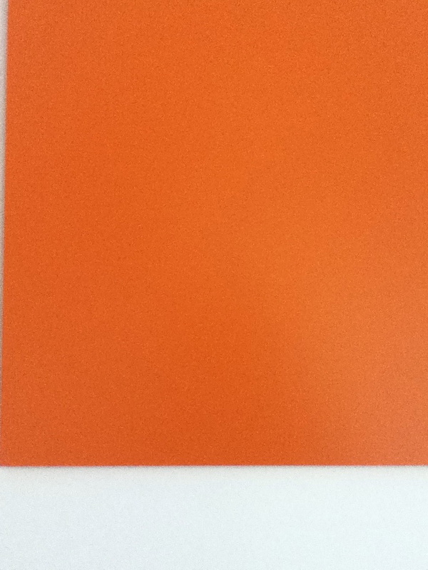
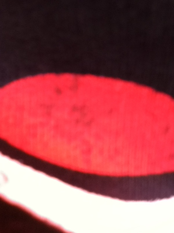
This is the second image I took of a chicken box focusing on the colour red with the flames on the box.
WWW: The colour red was in a shape of a flame EBI: If there weren't any shadows interrupting the photo |
Photo shoot in school
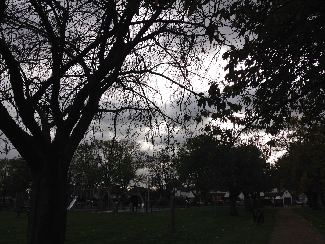
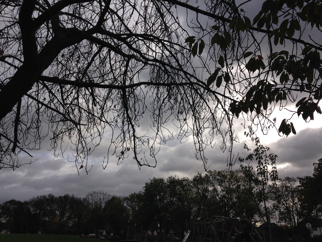
A trip to the park
|
|
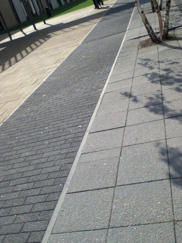
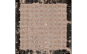
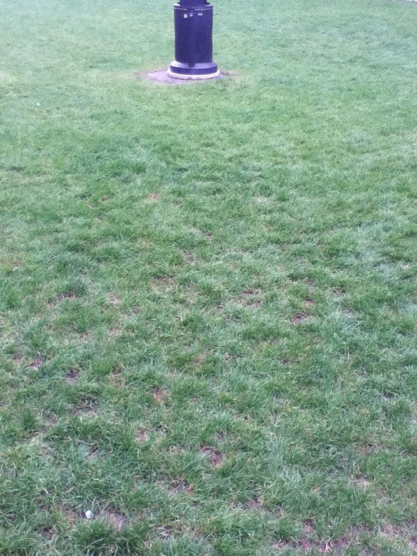
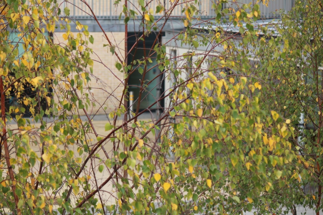
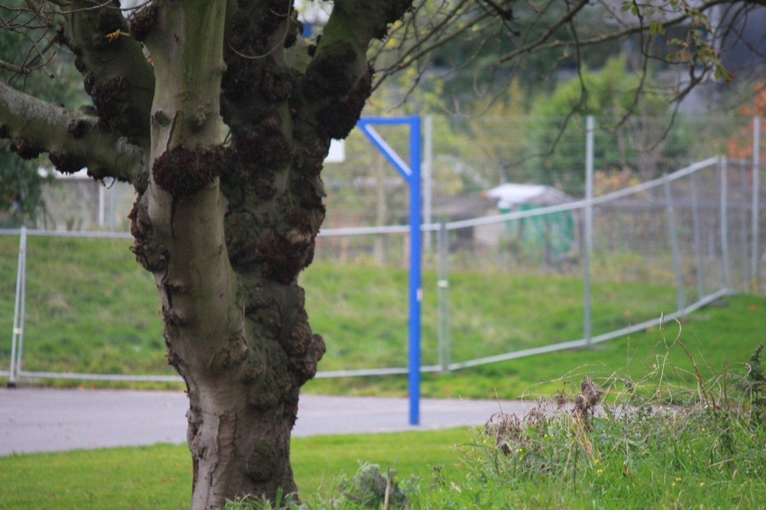
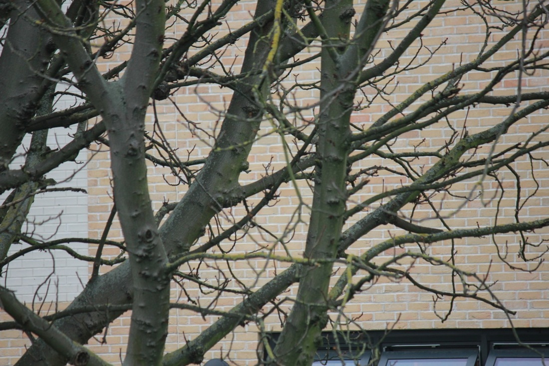
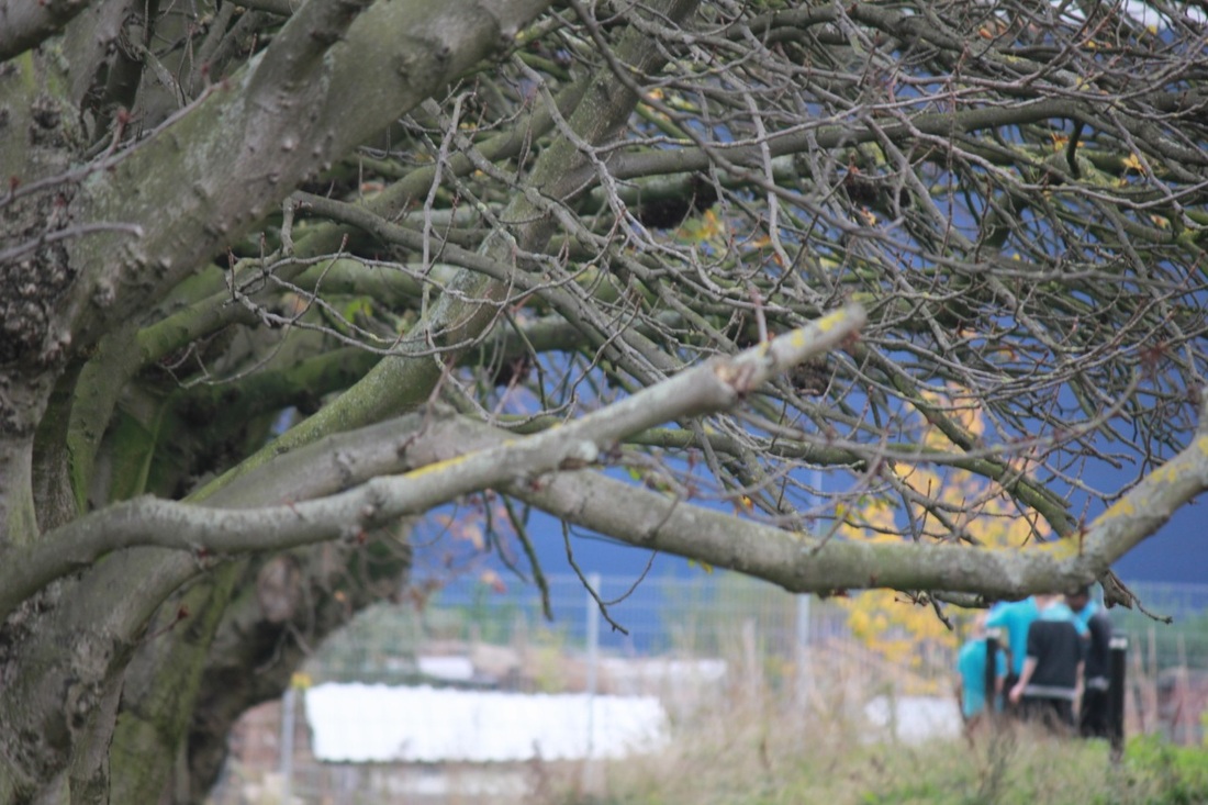
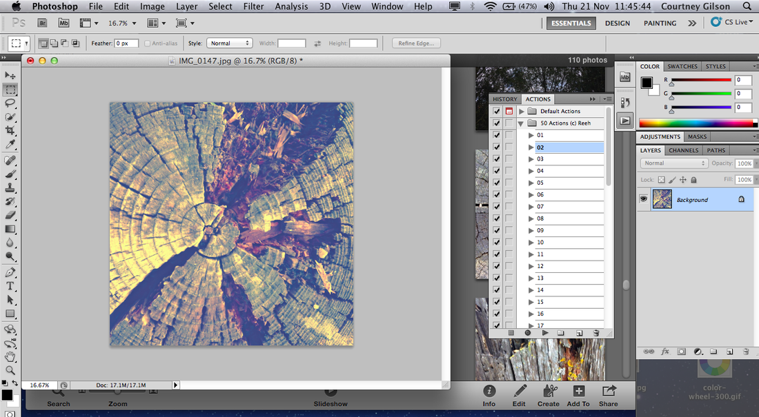
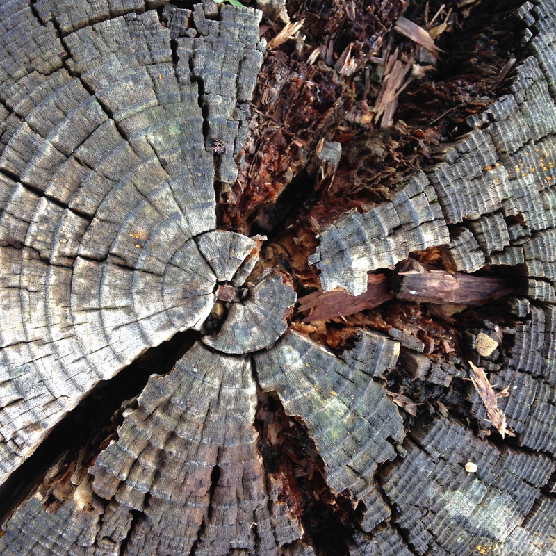
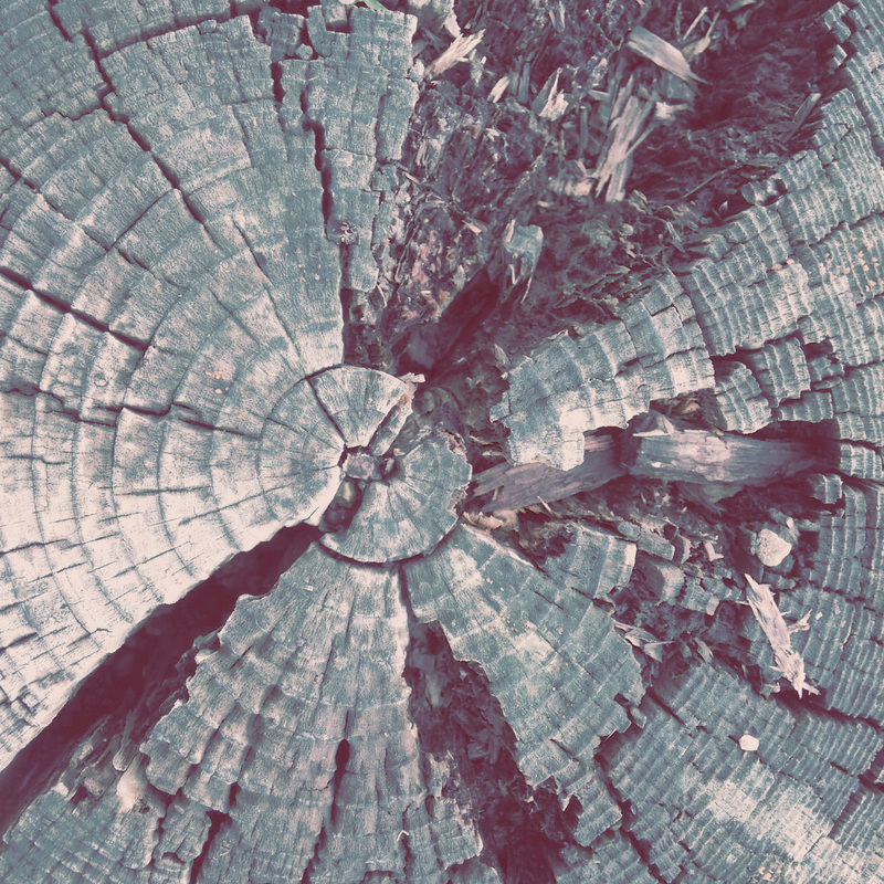
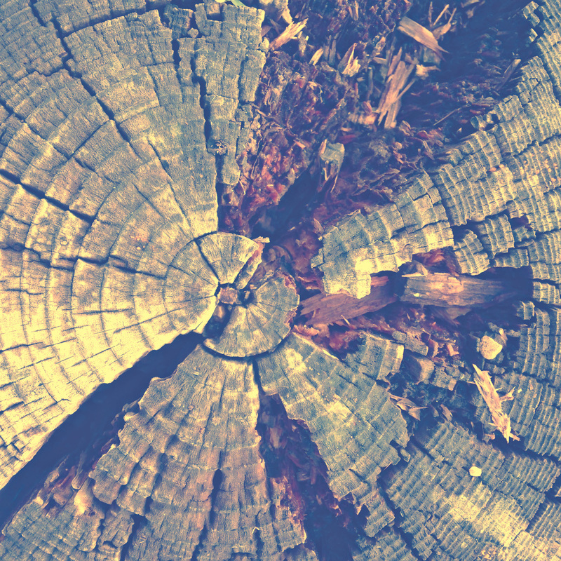
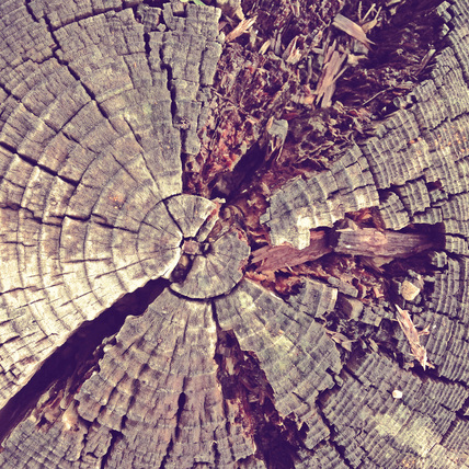
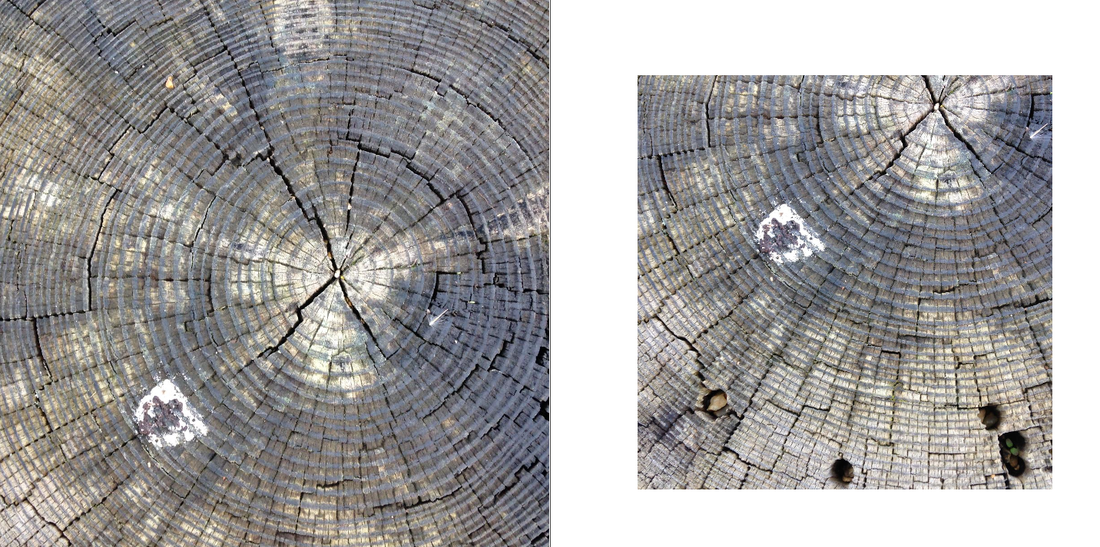
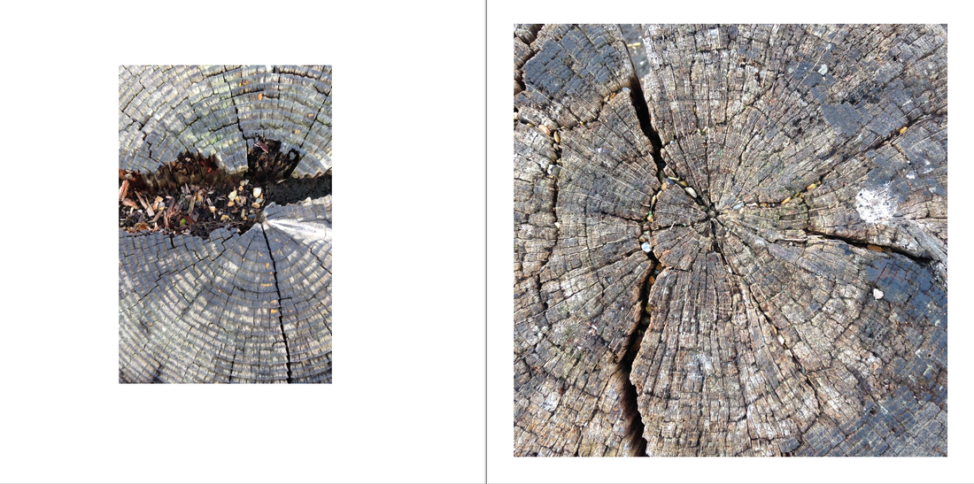
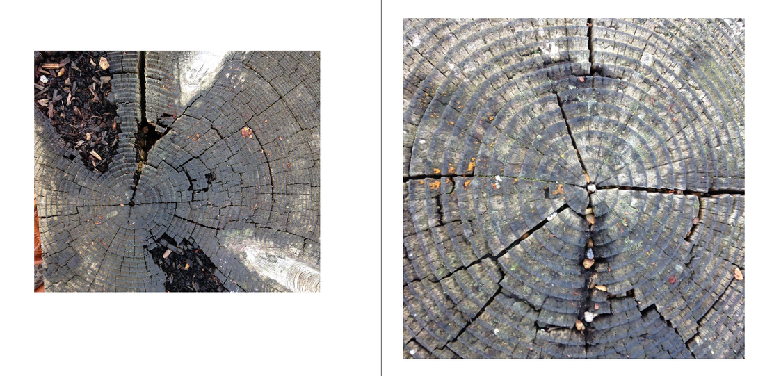
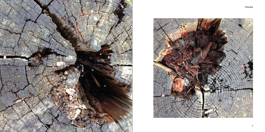
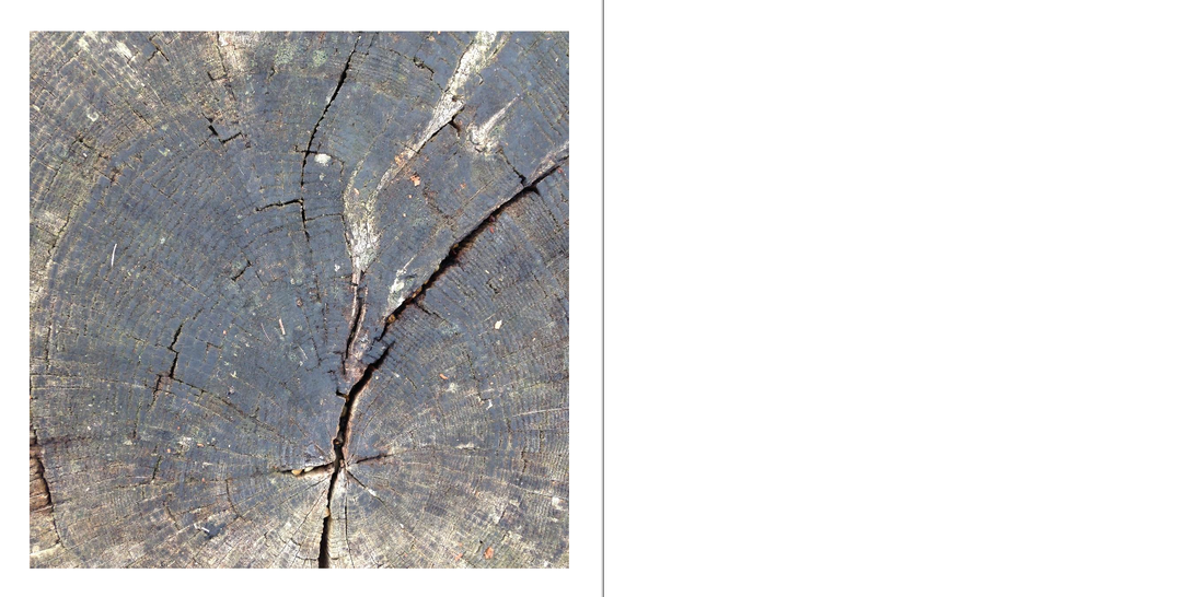
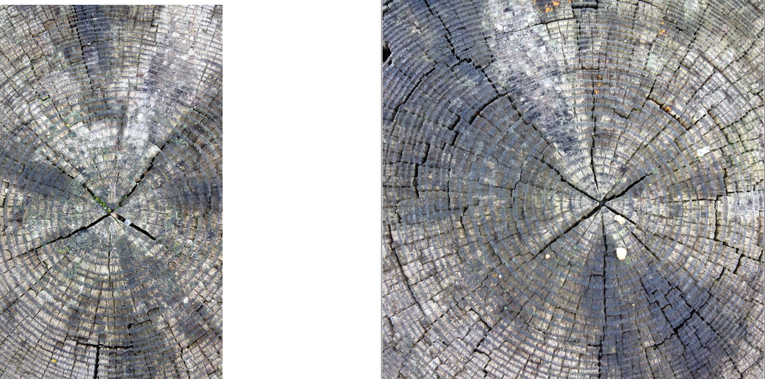
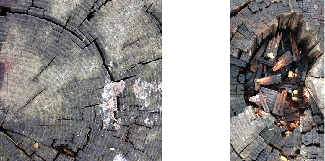
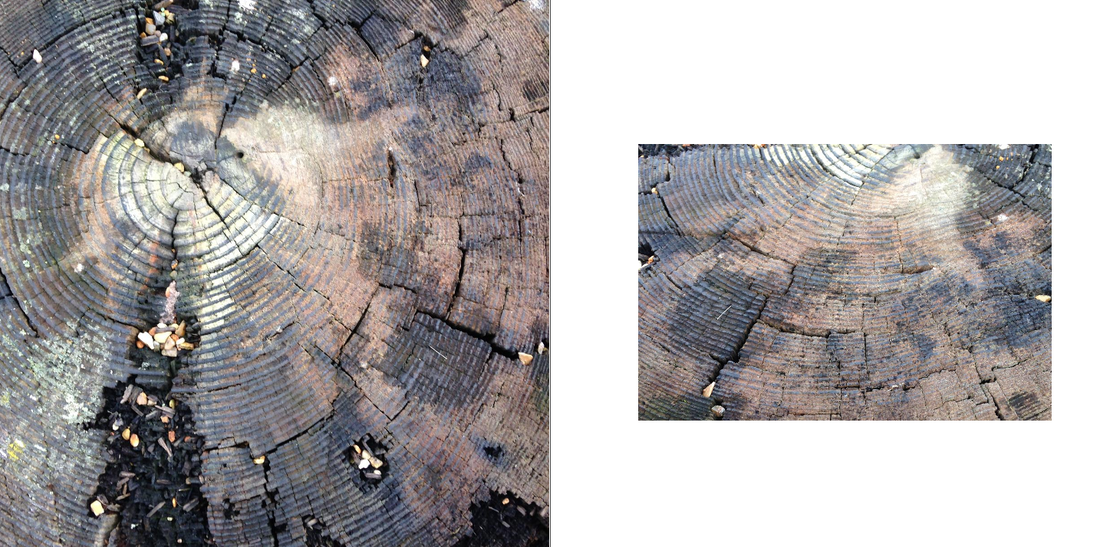
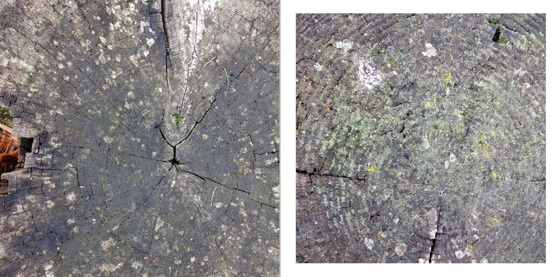
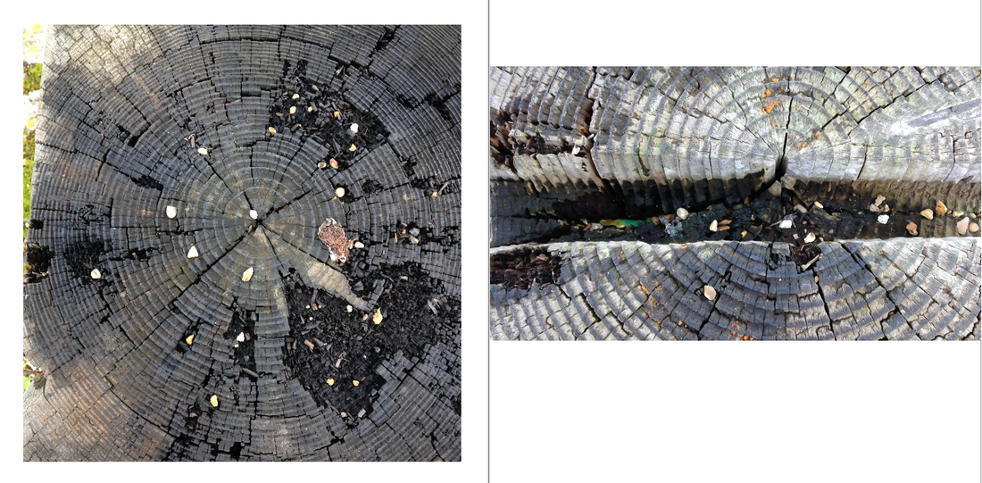
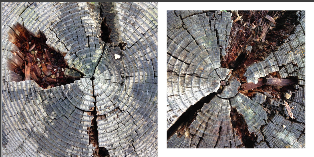
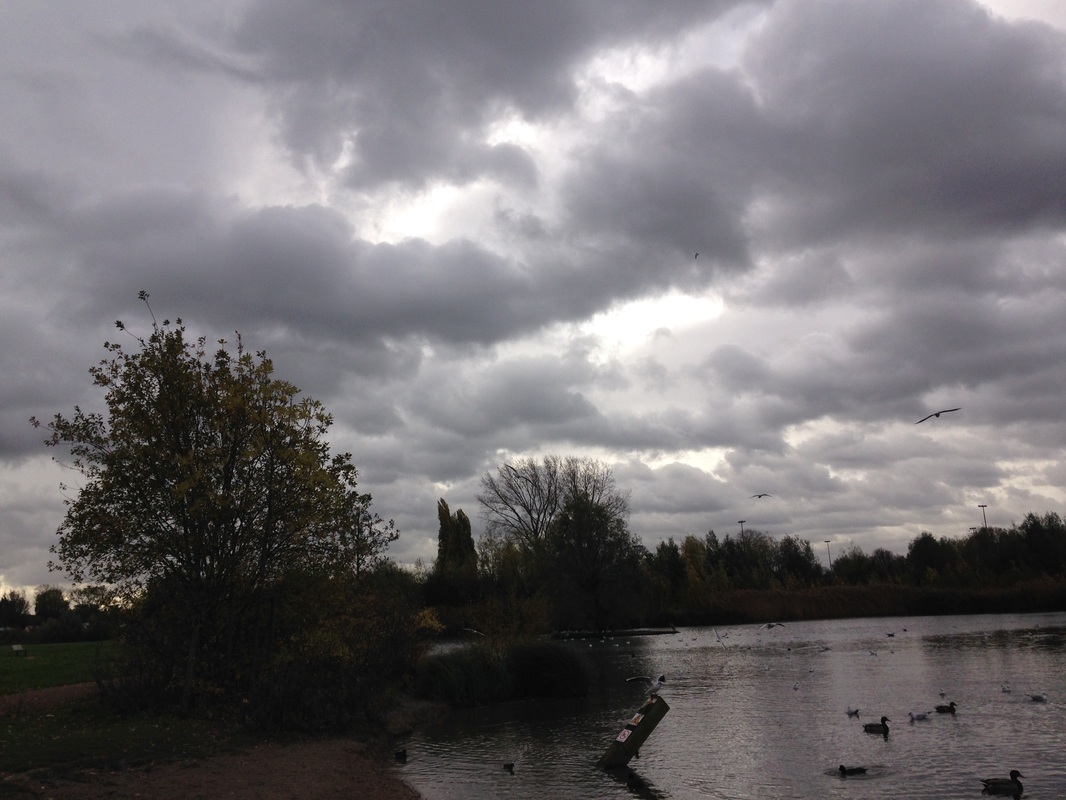
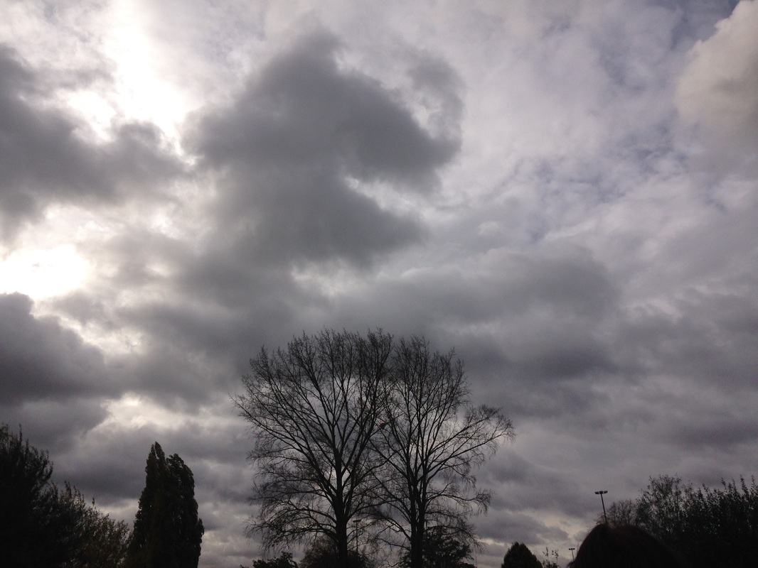
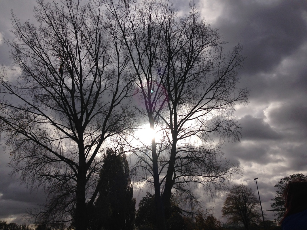
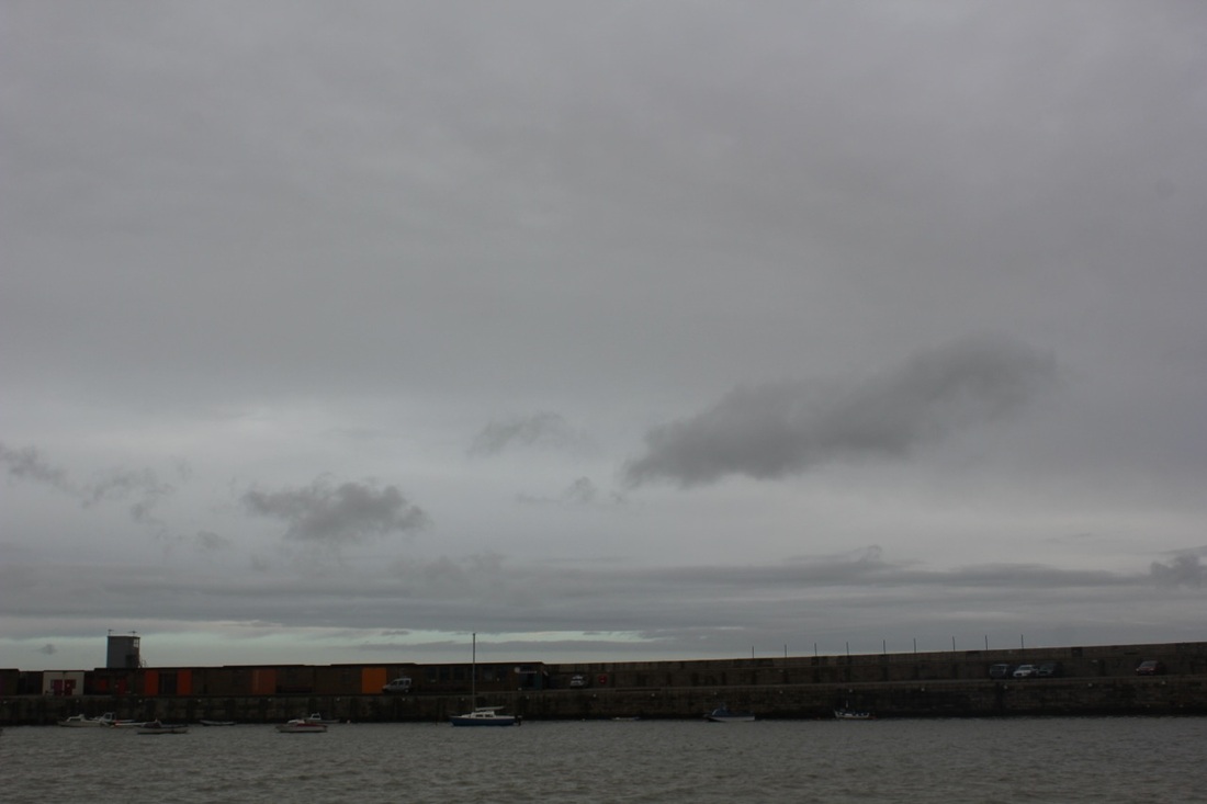
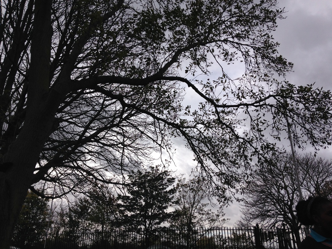
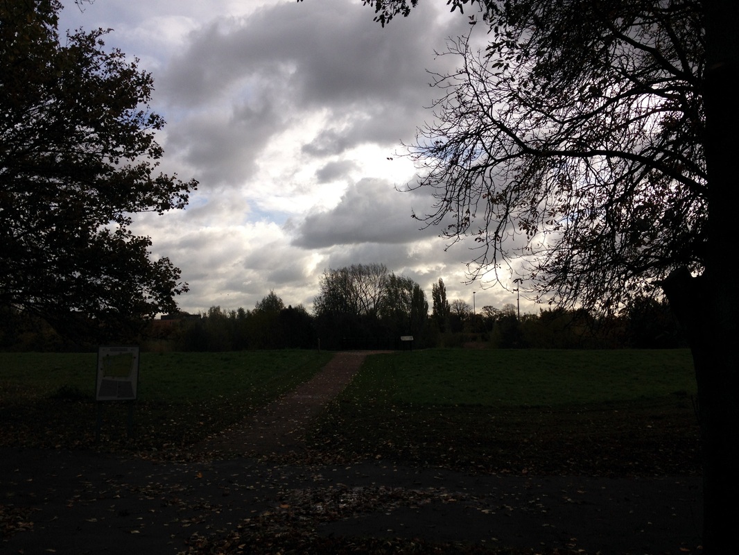
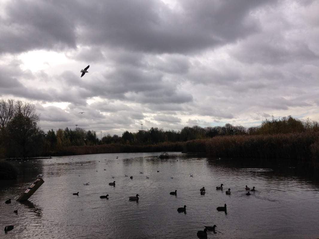
During school time we took a trip to Sutcliffe Park and we had to focus on an element or something to do with abstraction. Originally I was going to take pictures far away from the trees so that the trees were in colour, but I decided to look at it as abstraction and then I started going up close to make a contrast of trees/shapes against the sky line. Afterwards I moved onto one of the formal elements (patterns). I produced square photos of the pattern of worn out logs.
I then thought I would choose one of my ideas and develop them a bit further using Photoshop and choosing my own action. I then downloaded an Action I liked from a website called Deviant Art then once it was downloaded I dragged the selected photo to Photoshop and clicked on Actions and then clicked on the 50 Actions I had downloaded and selected each effect to see which worked best. I did this 3 times to the same photo which gave the photo a different effect and meaning. |
|
|
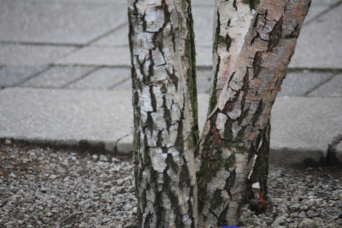
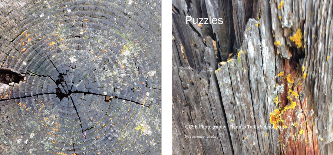
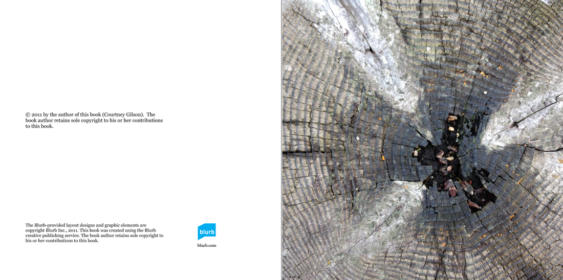
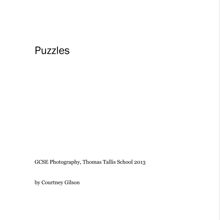
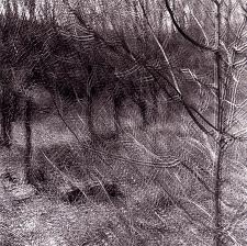
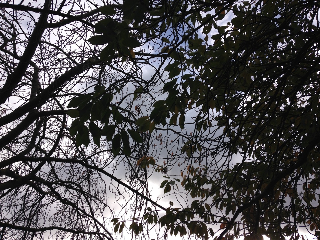
My book of puzzles

How did I do this?
I used the Blurb software to create the design of the book using my tree texture pictures. I then thought of a name - 'Puzzles', because the images were like a set of mysterious clues. I then selected each image to put on a double page. I didn't order them in any particular way so that they left you a bit puzzled.
I used the Blurb software to create the design of the book using my tree texture pictures. I then thought of a name - 'Puzzles', because the images were like a set of mysterious clues. I then selected each image to put on a double page. I didn't order them in any particular way so that they left you a bit puzzled.
Ralph Eugene Meatyard
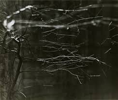
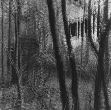
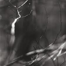
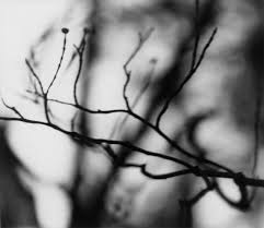
My Own Work inspired by Ralph Eugene Meatyard

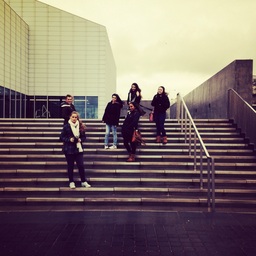
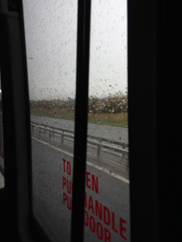
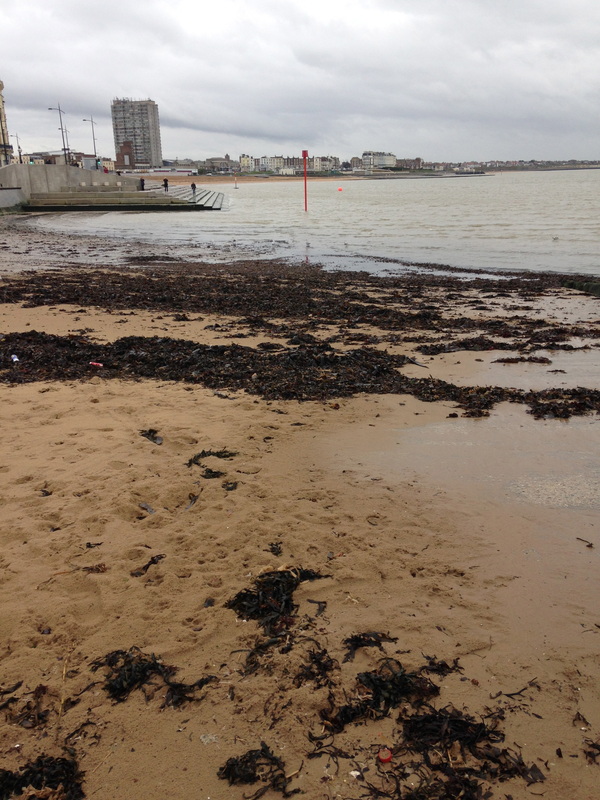
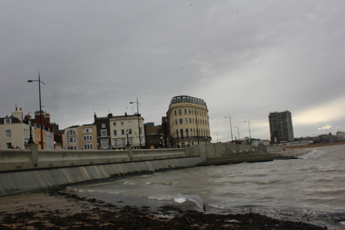
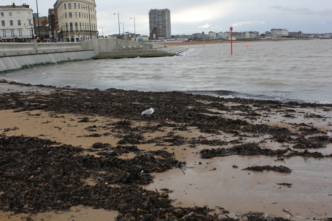
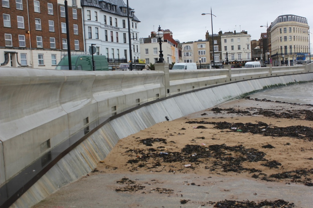
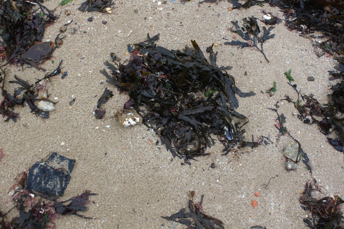
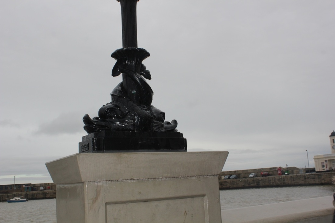
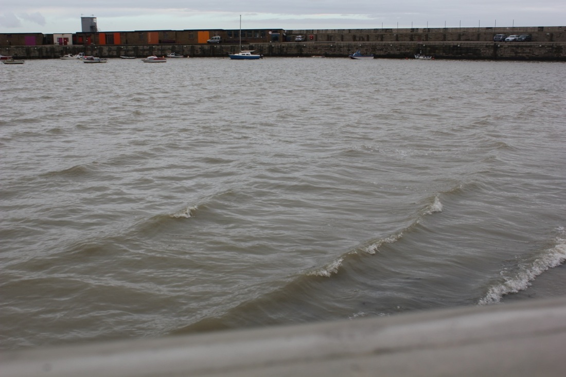
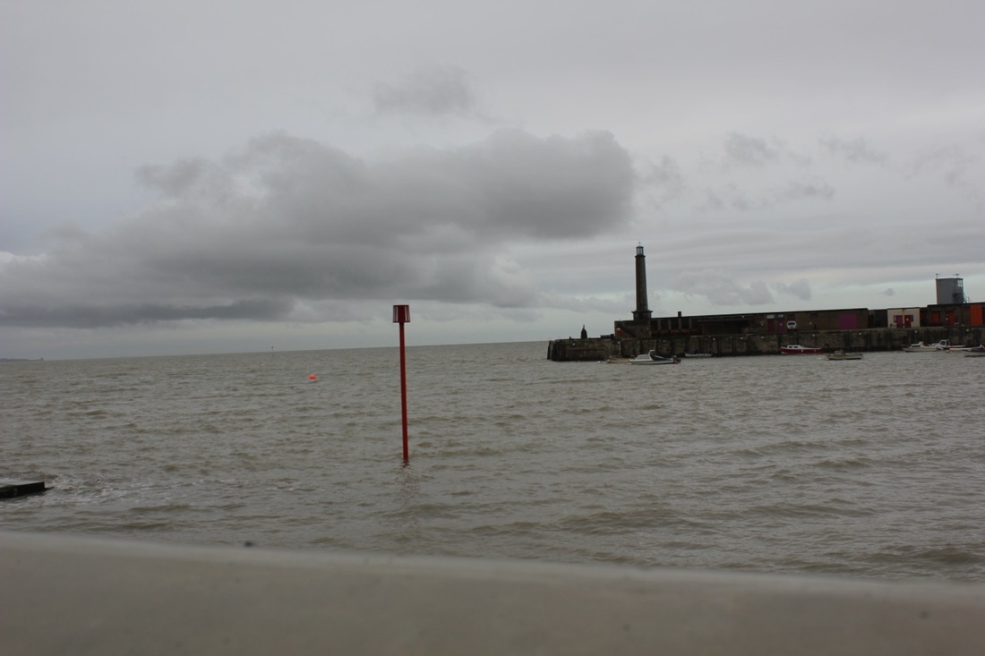
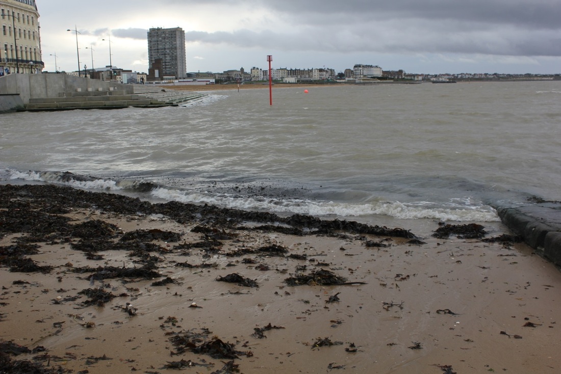
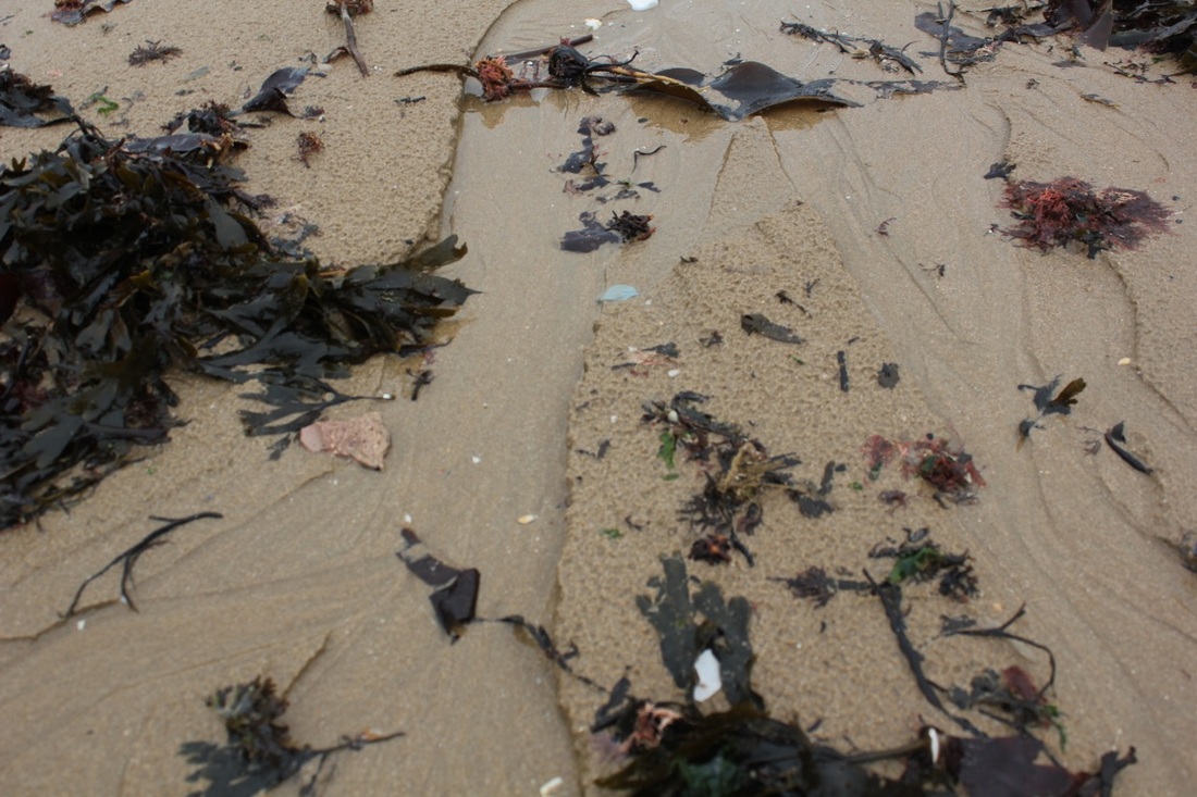
A trip to the seaside
|
Our soggy trip to Margate was successful as the trip contained art as well as photography we went to the Turner Gallery just opposite the sea front and the images were very peculiar. We saw an exhibition by an Irish artist. There were visual abstractions and objects in her gallery of work. It was amazing. On the way our coach broke down a couple of times but it was definitely worth it. I got to find out a lot about art and the relation between art and photography. We got there on a coach and roughly took us 2 hours and a half because of the fault of the coach breaking down and we were in the hard shoulder a lot of times. Other than that we looked around the Turner Contemporary Gallery and went of for an hour for lunch and explored the rest of Margate. On our little adventure we found a lot of small shops that sold old fashioned designer clothes. And of course I treated my self to a traditional fish and chips. I found the gallery an inspiration because there was a sculpture with a real shark's heart in side. It was weird but impressive.
|
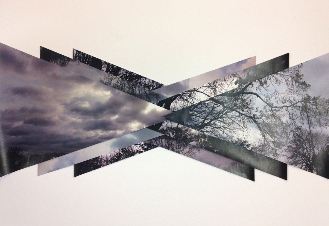
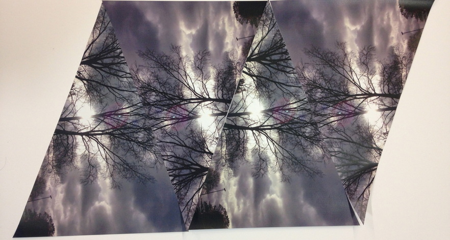
My Final Piece


I was interested in some images I had seen online where the artists had disturbed the image by cutting and reforming it in various ways. I decided I wanted to try something similar. This involved printing out my images quite large and cutting them into triangles. I then experimented with laying them out in different formations.
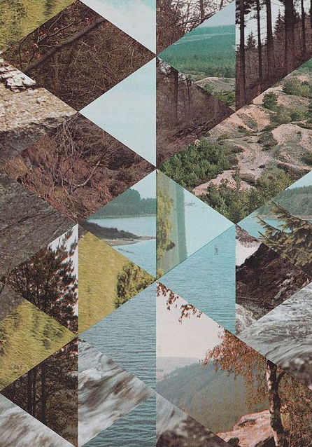
My first finished peice
My second finished peice
Evaluation
Originally I had taken pictures of close up of trees so that the whole perspective of the picture was full of patterns of features of trees with a sky background but the effect was changed physical with no edit I just turned my phone upright so that the camera was facing upwards so the colours had a contrast with a grey and black colour for the image. Once I produced over 100 pictures of the same idea I then selected the best ones what I could work with and the ones that worked out the best with the same theme. Once that was done I printed off the 8 photos I chose in A3 so that there was a big image that I could cut and experiment with. This is when I came up with the idea of triangles because my previous work that I had done was pasted on top of each other forming triangle shapes of separate images which inspired me for my final pieces. Once the photos were printed I cut them down to roughly the same size in triangular shapes so I could experiment with them. At first I was finding it hard to get them the same size but I didn't give up and tried over and over again until I got it right. Whilst cutting down I realised I had doubles of pictures but I continued cutting them down. Once I cut them the same shape I experimented with the pictures and then I came across a pattern with the trees on the right, which fitted nicely together. Then I realised I had a lot of images left and it was a shame to waste them so I went on to experiment and formed the other piece which was an idea of overlapping the pictures but with some kind of a symmetrical arrangement.
I am really pleased with the outcome of both experiments. They look great mounted on board.
I am really pleased with the outcome of both experiments. They look great mounted on board.
